Here is an interesting design failure. A year or two ago, the entry gates on my local stations had a message from a charity saying with the slogan “no-one in Kent should face cancer alone.”. A good message, and basically well thought out. The problem is, that they were printed on two sides of the entry gates, which open when you put your ticket in it: as a result, one side of the gate says “face cancer alone”, and this part of the message is separated out when the gates open:
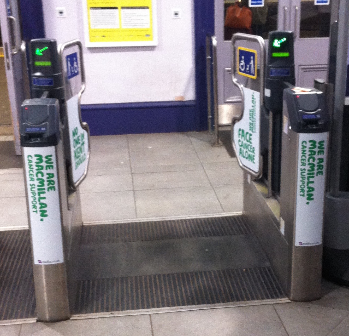
Interestingly, someone clearly noticed this. When a repeat of the campaign ran this year, with more-or-less the same message, it had been modified so that one side of the gate now says “don’t face cancer alone”:

There’s a design principle in here somewhere, along the lines of thinking through the lifetime of a user of the system, not just relying on a static snapshot of the design to envision what it is like.